Duolingo, the gamified language learning app known for its mascot Duo the owl, has sported a few different appearances over the years. While some users might find the current interface familiar, others might wonder why does Duolingo look old compared to other apps. Here’s a breakdown of the reasons behind Duolingo’s design choices:
Focus on Function over Frills: Duolingo’s core mission has always been to make language learning accessible and engaging. Early on, the interface prioritized clear functionality over cutting-edge aesthetics. This resulted in a straightforward, cartoonish design that some might perceive as outdated.
Gradual Updates: Unlike some apps that roll out dramatic overhauls frequently, Duolingo has opted for a more measured approach. They’ve implemented changes over time, like the shift from a skill tree to a more linear path, while maintaining a recognizable base design.
Prioritizing Stability: Duolingo boasts a massive user base. Maintaining a consistent and stable interface ensures a smooth learning experience for everyone. Frequent drastic changes could disrupt user habits and learning progress.
The Ever-Changing App Landscape: Mobile app design trends evolve quickly. What might have seemed modern a few years ago could appear dated compared to today’s sleek, minimalist interfaces. However, Duolingo might prioritize usability over chasing the latest fads.
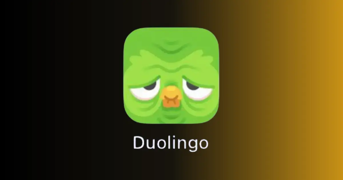
The Melting Duo Icon Caper: In 2022, Duolingo surprised users with a temporary melting Duo icon. This playful experiment wasn’t a permanent design shift, but rather a way to grab attention and encourage engagement.
So, Why Does Duolingo Look Different?
Duolingo’s design choices prioritize functionality, user experience, and stability. While it might not boast the flashiest interface, the app focuses on delivering effective language learning in a clear and consistent way. That being said, Duolingo does occasionally experiment with its design, so future updates could bring a more modern look!
Also read: What Is Skybox in Networking? What Is Skybox Security 2024?
What is Duolingo?
As explained that Duolingo is a gamified language learning app. But here’s a more detailed explanation:
Duolingo is an educational technology company that offers a popular mobile app and website for learning languages. It provides a free service with optional paid features. Here are Duolingo’s key features:
- Language Courses: Duolingo offers a wide variety of languages, over 40 at present, including popular languages like Spanish, French, and German, and even less common ones like Hawaiian and Navajo.
- Bite-Sized Lessons: Lessons are designed to be short and engaging, making it easy to fit language learning into your daily routine.
- Gamification: Duolingo uses game mechanics like points, streaks, and leaderboards to keep users motivated and engaged.
- Skill Building: The app focuses on building core language skills like vocabulary, grammar, reading comprehension, and listening.
- Accessibility: Duolingo’s free basic service makes language learning accessible to a broad audience.
While some might find the interface a little dated, Duolingo remains a popular and effective tool for building foundational language skills.
How to Change the Duolingo Icon Back to Normal?
There are two ways to change your Duolingo icon back, depending on how it got changed in the first place:
If your icon is the melting Duo:
This was a temporary promotional stunt by Duolingo. Here’s how to switch it back to the normal icon:
- Open the Duolingo app.
- Locate the fire or streak icon near the top of the screen (it might look like a flame).
- Tap on the fire icon.
- Scroll down to the “Streak Society” section.
- Select “Change App Icon.”
- Choose “Restore Original Icon.”
If your icon is different because of a subscription:
If you have a Super Duolingo or Duolingo Max subscription, you might have a different app icon representing your membership. Here’s how to switch back:
- Open the Duolingo app.
- Tap on the Duo icon in the top right corner (it might look like an owl head).
- Scroll down to the “Super App Icon” or “Max App Icon” option (depending on your subscription).
- Tap the toggle switch to turn it “Off.”
Important Note:
If you’re using an Android device and none of the above methods work, there might be third-party icon changer apps involved. These are not recommended by Duolingo and could potentially cause issues with the app. It’s best to stick to the official methods mentioned above.
WHY MY DUOLINGO APP ICON MELTING? | How to Change Duolingo App Icon Android I Last Error
Content Contributor: Sridhar Naresh


